
Operations Redesign
Overview
Summary:
When obilet's B2B operations platform was flagged for intellectual property concerns, the team was forced to scrap the existing interface entirely and rebuild from scratch… on a tight timeline, with zero tolerance for user confusion. As UX Lead, I directed the end-to-end redesign of a complex, data-dense enterprise dashboard used daily by bus operators across Turkey to manage routes, passengers, ticketing, revenue, and fleet operations.
The challenge wasn't just aesthetic. It was strategic: design something meaningfully different from the incumbent system, while keeping the learning curve low enough for users already trained on a competitor's interface.
My Role:
As the lead UX designer, I collaborated closely with cross-functional teams, including product managers, developers, and business stakeholders. My primary responsibility was leading the design process from ideation to implementation, ensuring that user experience improvements addressed usability pain points while working within technical constraints.
Defining the problem
The Trigger:
Obilet's operations platform had been modeled closely after the dominant industry tool a system so widely used that operators across Turkey knew it by heart. When the original vendor raised intellectual property concerns, leadership issued a directive: redesign the entire platform from scratch, change the UX, and do it fast.
The Core Tension:
This created a design paradox. Users had years of muscle memory built around the incumbent system. A radically different UI would be legally safe but operationally disruptive. A familiar one would minimize the learning curve but risk further legal exposure. The goal was to find the narrow path between the two.
The Stakes:
This wasn't a consumer app where users could afford confusion. Bus operators use this platform to sell tickets, manage departure times, track passengers, handle refunds, and close daily cash registers; often under time pressure, at physical terminals, on small screens.
Client
Obilet (acquired by BlaBlaCar)
Year
2026
Understanding the user
#userresearch #competitiveanalysis #contextualinquiry
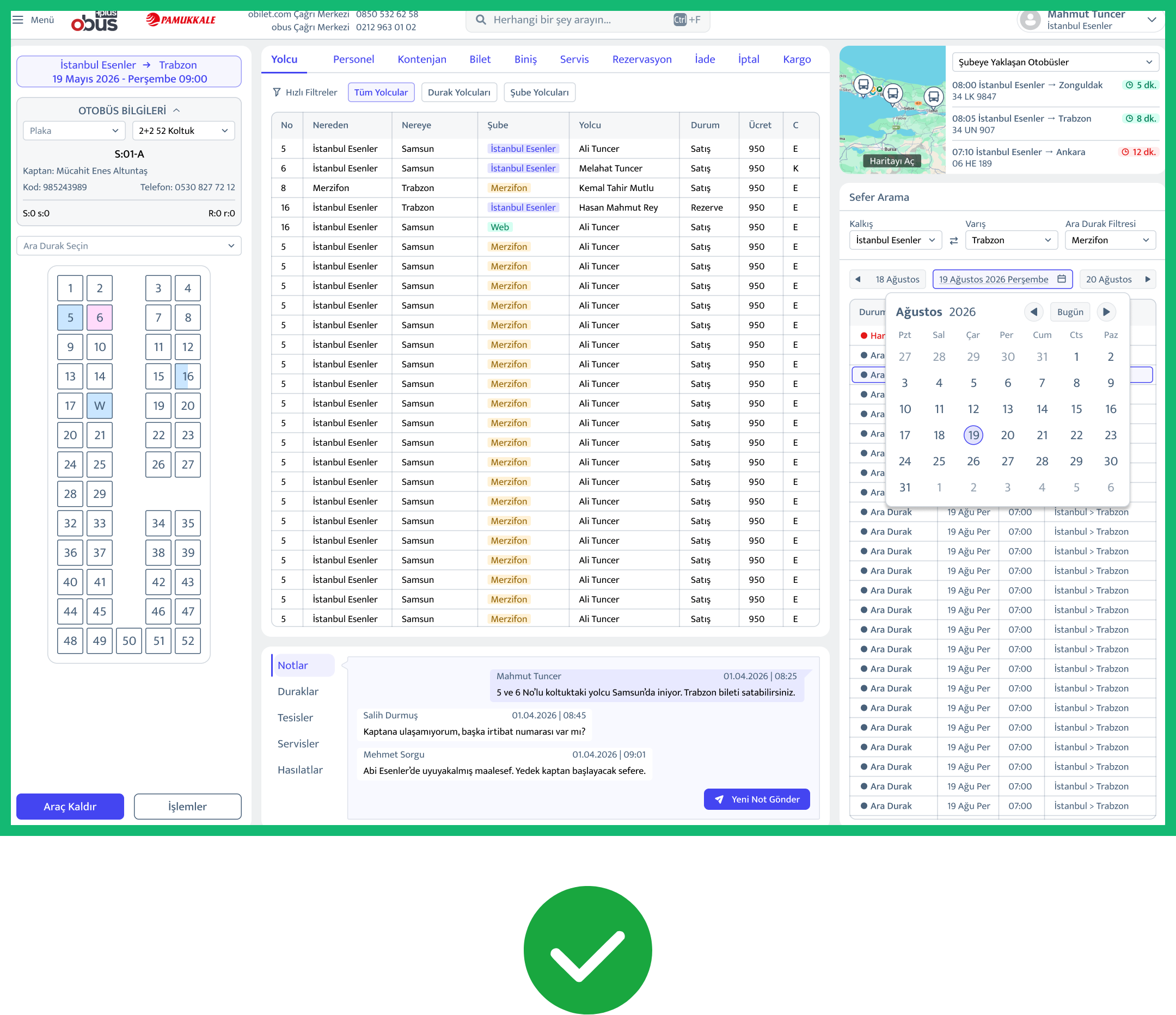
Before a single wireframe was drawn, I ran a structured research phase with 20 operator participants to map task priorities and uncover pain points in the existing system
Top user priorities (by frequency):
Reports: 10 users (50%)
Route occupancy: 8 users (40%)
Stop-based passenger management: 8 users (40%)
Route open/close, vehicle and staff assignment: 4 users (20%)
Vehicle tracking: 3 users (15%)
Findings:
This told us that the dashboard's primary job was not ticketing. It was visibility. Operators needed to see the health of their operation at a glance before taking action.
I also analyzed screen resolution data across the user base, the most common display was 1366×768, followed by 1024×768 and it immediately constrained layout decisions: no full-width data tables, no deep nested panels, no hover-dependent interactions.
Design Approach
#informationarchitecture #gestaltprinciples #rolebaseddesign
Restructuring the Navigation
The incumbent system used a horizontal mega-menu that collapsed everything into
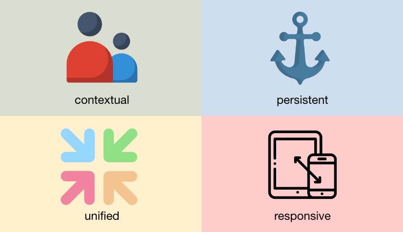
a top bar. I replaced this with a persistent left sidebar, a pattern familiar from enterprise tools like Salesforce, Notion, and Linear, that gave users a stable anchor as they moved between modules.
This single change accomplished two things: it felt different enough to be legally distinct, and it aligned with patterns operators encounter in modern enterprise software.
Operators familiar with the incumbent system could navigate the new interface without retraining, while the structural differences provided the legal distinction the company needed.
Collapsed state
After
Contextual Data Display
The platform covers 10+ operational modules with over 150 screens across desktop and mobile web. The challenge was consistent: how do you surface business-critical data without overwhelming the user?
Rather than loading every screen with all available information, I applied progressive disclosure throughout. Data appears in context, when and where the operator needs it. Proximity groups related data points, hierarchy surfaces time-sensitive information first, and secondary details reveal only when the user reaches for them.
Before
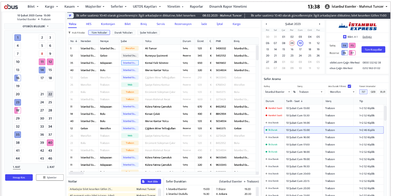
The redesigned interface consolidates the same workflow into a significantly
smaller footprint, reducing cognitive load without sacrificing functionality.
Admin view
Admin view
Admin view
Admin view
Clerk view
Designing for Two Roles
User research revealed two distinct mental models operating within the same system:
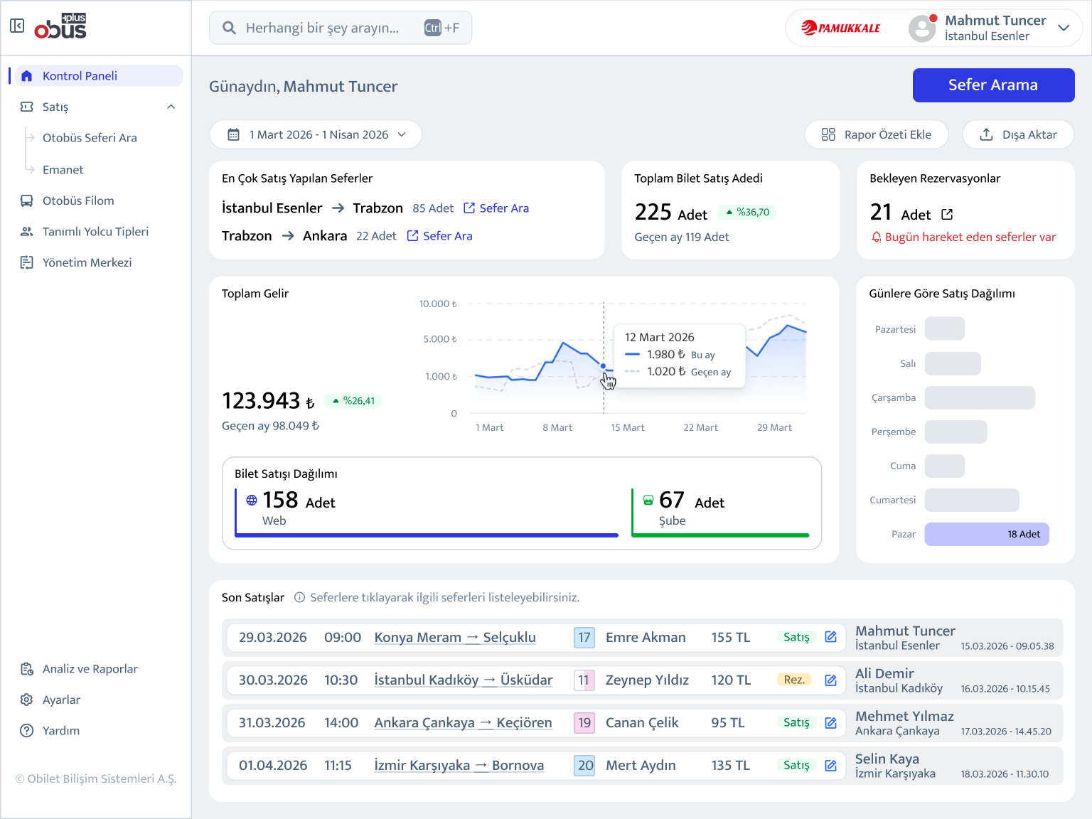
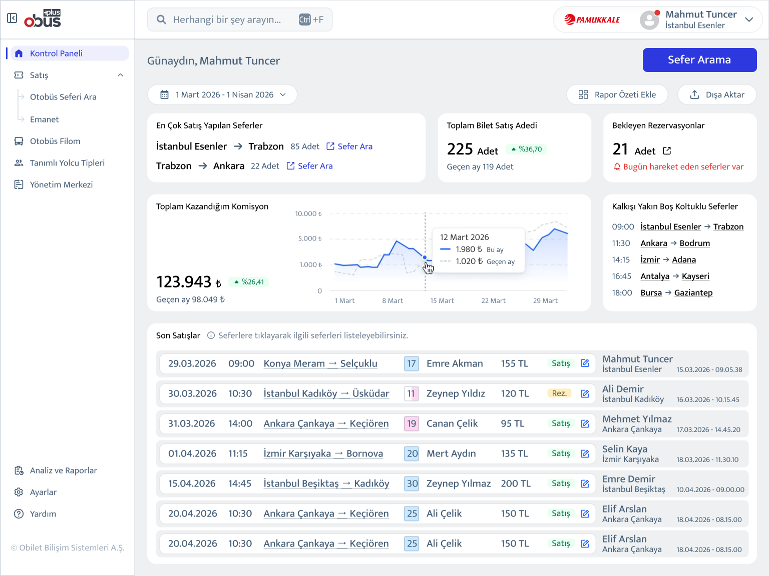
The Administrator thinks in aggregates: total revenue, sales trends, pending reservations, channel breakdown (web vs. branch).
The Clerk thinks in immediacy: commission earned today, upcoming departures with available seats, recent transactions.
Rather than building two separate platforms, I designed a single system with role-based dashboard surfaces. Same data architecture, different default views and information hierarchies. This reduced engineering overhead while serving both users meaningfully.
Clerk view
Clerk view
Clerk view
Same layout, different data priorities. The Administrator sees the overall business performance; the Clerk sees the commission rates and the most recent trips.
Expanded state
Without progressive disclosure, operators faced every data point simultaneously. The redesign surfaces details only when needed, keeping the interface focused while putting full context one tap away.
Design Exploration
#layoutiterations #prototyping
Vertical tab layout:
Sections stacked as tabs on the left panel, content area on the right. Clean, but created too much vertical scrolling on 768px-height displays.
Dropdown navigation:
Collapsible top-level nav with expandable sub-sections. Familiar, but difficult to navigate quickly during high-pressure ticket sales.
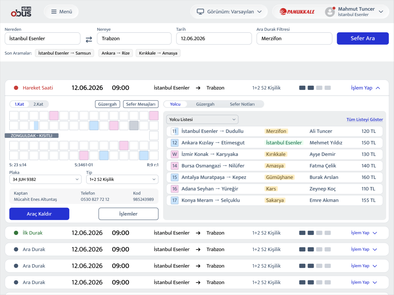
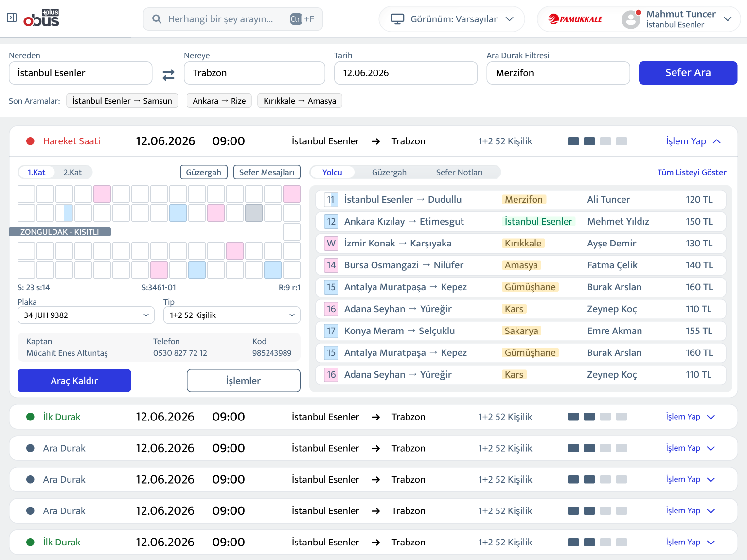
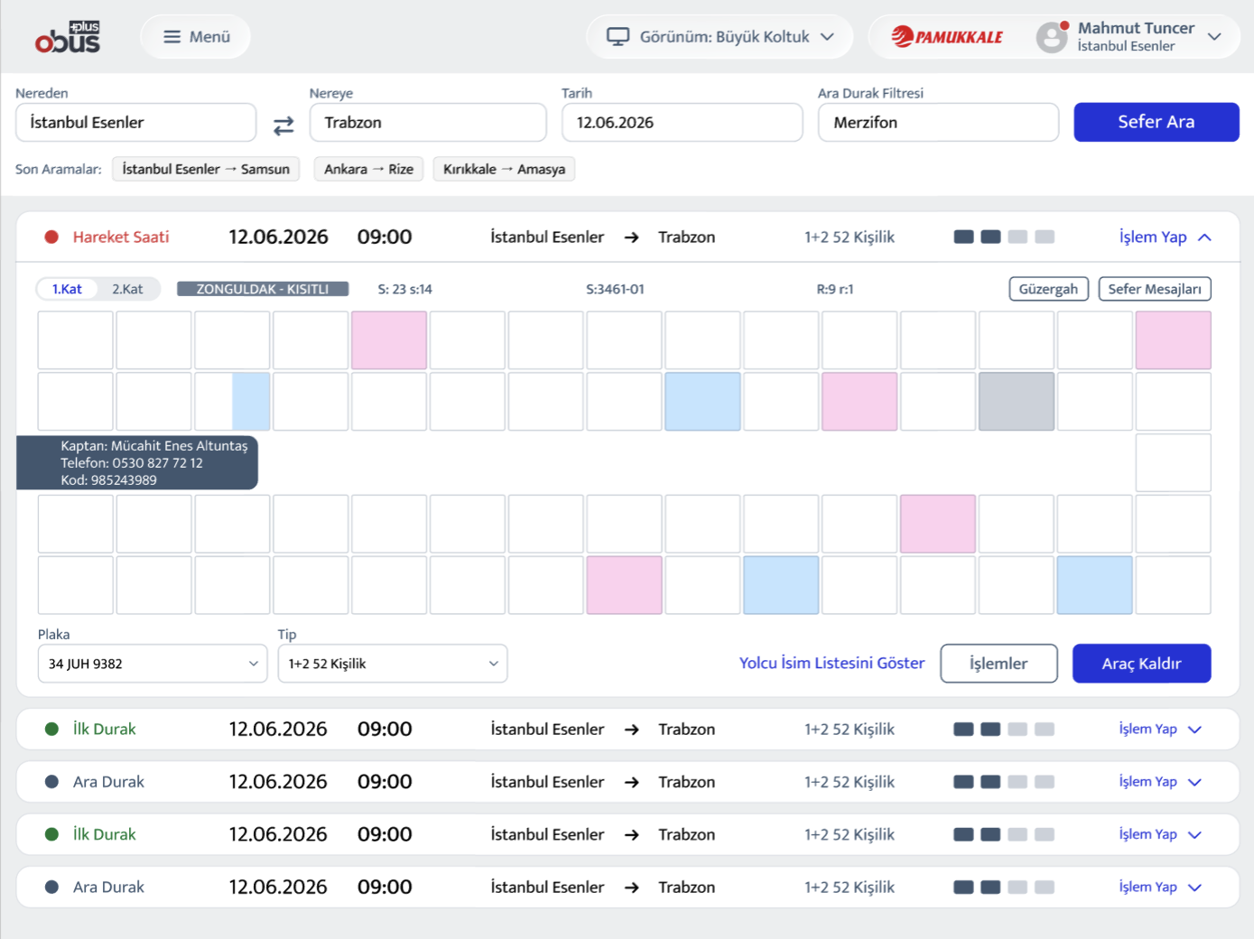
Horizontal tab with contextual panels:
The final direction. Tabs anchored to the content panel, with a persistent sidebar for journey search. This kept the most frequent actions, searching routes, viewing passengers, selecting seats, within a single coherent view without requiring navigation away.
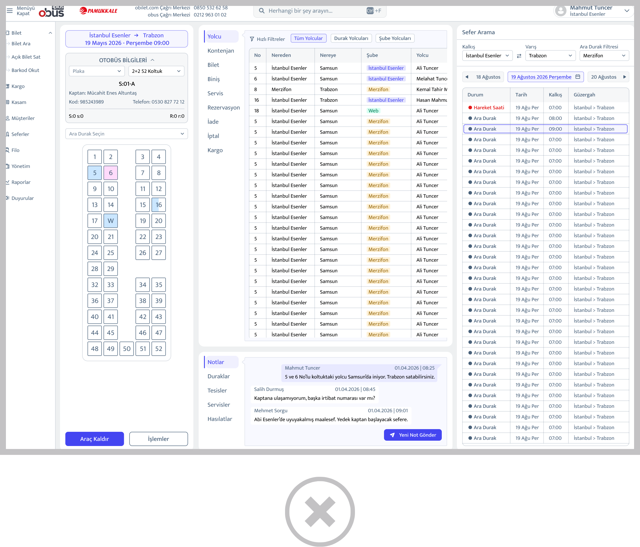
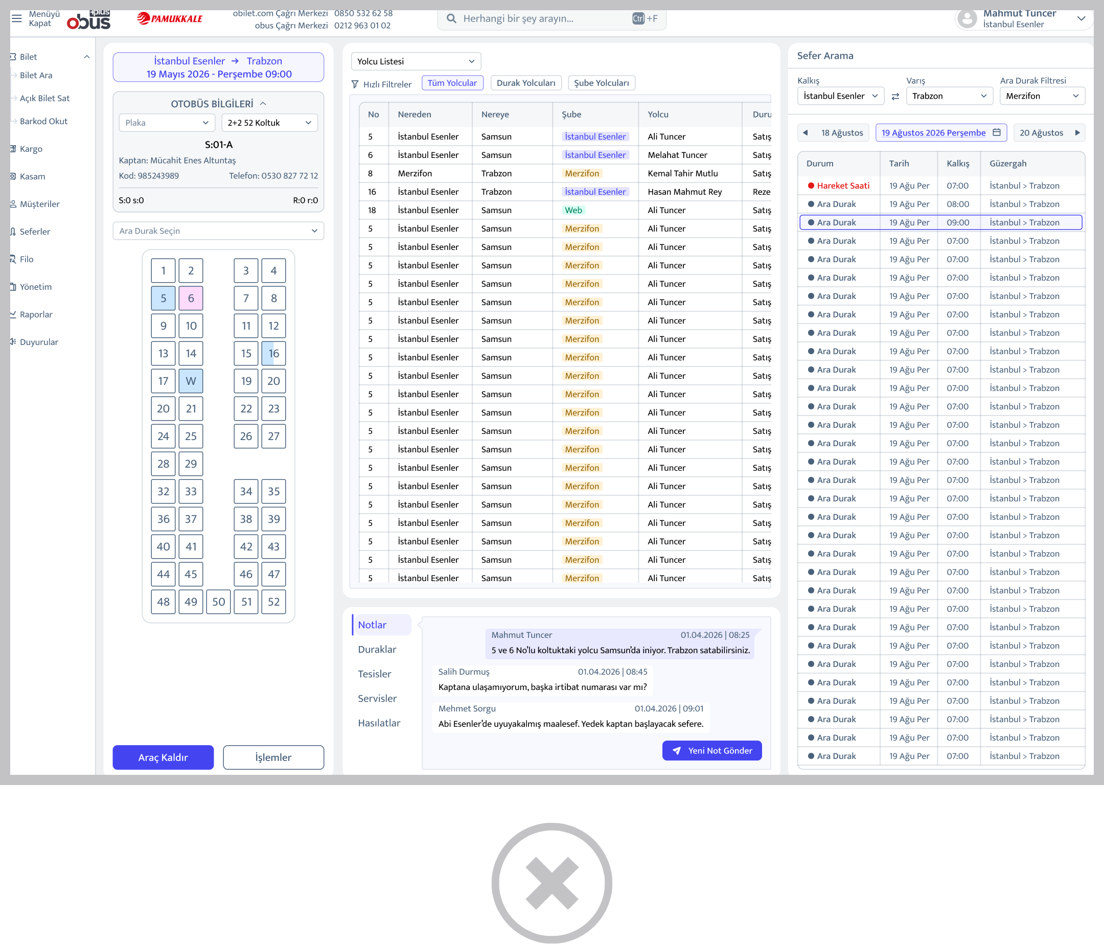
The final Route Search screen reflects this: Route list, passenger manifest, seat map, and departure timeline all accessible from one surface, switchable without full page reloads.
Key Design Decisions
The redesigned platform launched across desktop and mobile web,
covering the full operational scope of a bus company's day-to-day needs.
1) Role-based dashboards
Administrators see revenue trends, total ticket counts, channel distribution, and pending reservations at a glance. Clerks see their personal commission, upcoming departures with seat availability, and a transaction feed. Information relevant to their next action, not the company's quarterly performance.
2) Persistent left navigation
A fixed sidebar replaced the horizontal mega-menu, giving operators a stable orientation point across all 10+ modules. Navigation no longer required memorization of menu hierarchies.
3) Unified route search surface
The Route Search screen consolidated passenger list, seat map (with double-decker support), route timeline, and departure notes into a single panel. Operators can switch views, list or seat layout, without leaving the screen context.
4) Responsive constraints respected by default
Every layout decision was made against the 1366×768 baseline.
No feature was designed for large screens first.
Reflections
This project was unlike any other in my experience, not because of its scale, but because of how the constraints were set. Most redesigns begin with user problems. This one began with a legal directive.
What that forced was a kind of design clarity I hadn't encountered before. Every decision had to be justified on two axes simultaneously: is this meaningfully different from the incumbent, and does it still make sense for the user? That tension, held consistently across 150+ screens, sharpened my instincts for what actually matters in interface design versus what is merely inherited convention.
The platform is currently in active rollout. Adoption data is being collected. I will update this case study with usage metrics as they become available
- June 2026